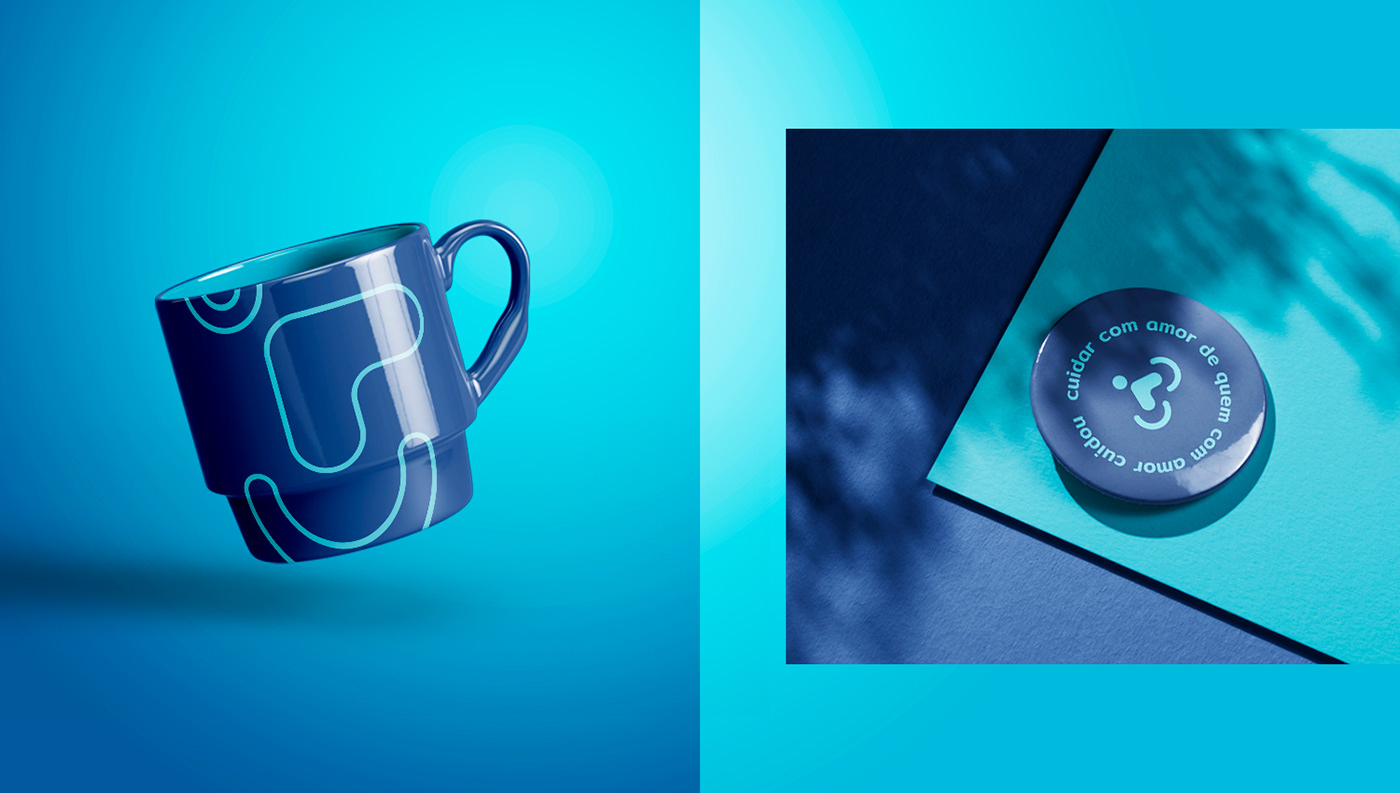
Cuidar com amor de quem com amor cuidou.
PT |
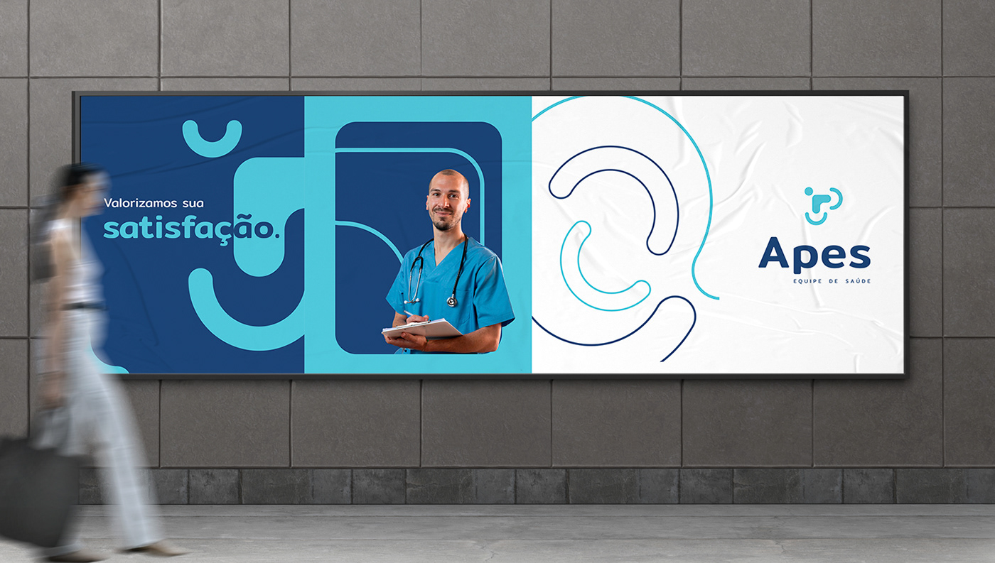
Esse é o lema da Apes. Oferecer qualidade de vida a seus pacientes adultos e idosos através do fornecimento de cuidados qualificados, oferecendo também aos familiares segurança e tranquilidade por meio de relatórios diários do plantão realizado, com um atendimento personalizado e humanizado realizado por técnicos de enfermagem e cuidadores selecionados e capacitados.
-
Caring with love for those who cared with love.
EN |
This is the motto of Apes. Offer quality of life to its adult and elderly patients through the provision of qualified care, also offering family members security and tranquility through daily reports of the shift performed, with personalized and humanized care provided by selected and trained nursing technicians and caregivers.
Client: Apes | Service: Visual Identity | Year: 2022 | Designer: Charles Bonaretti

O projeto
PT |
O desenvolvimento do logotipo se baseia em alguns elementos utilizados de forma constante no ramo de cuidados, porém, executado de maneira diferente de seus concorrentes, que utilizam de forma direta corações e mãos indicando proteção, por exemplo. Nesse projeto, o símbolo busca transmitir esses significados de forma subjetiva, fugindo dos padrões convencionais. Seu estilo permitiu também ampliar a identidade por meio da criação de grafismos que se comuniquem com toda a marca e fortaleçam a identidade, gerando pregnância.
A tipografia recebeu pequenos ajustes para melhor harmonizar com o todo, sendo que a letra "p" teve sua parte inferior reduzida para que a tagline não se distanciasse de forma exagerada do nome. Houve também um leve arredondamento nos cantos internos da tipografia, afim de causar um efeito ainda mais humano.
As cores foram escolhidas com base nos atributos da marca, sendo coerentes com os adjetivos mencionados, como madura, alegre e responsável, por exemplo.
-
The project
EN |
The development of the logo is based on some elements that are constantly used in the care business, however, executed differently from its competitors, which directly use hearts and hands indicating protection, for example. In this project, the symbol seeks to convey these meanings in a subjective way, escaping from conventional standards. Its style also allowed expanding the identity through the creation of graphics that communicate with the entire brand and strengthen the identity, generating pregnancy.
The typography received small adjustments to better harmonize with the whole, and the letter "p" had its lower part reduced so that the tagline would not be exaggeratedly distant from the name. There was also a slight rounding in the inner corners of the typography, in order to cause an even more human effect.
The colors were chosen based on the brand's attributes, being consistent with the adjectives mentioned, such as mature, cheerful and responsible, for example.